Prettify Minerva case study
Overview
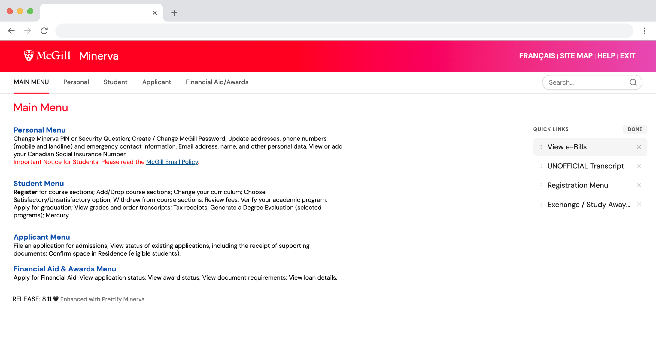
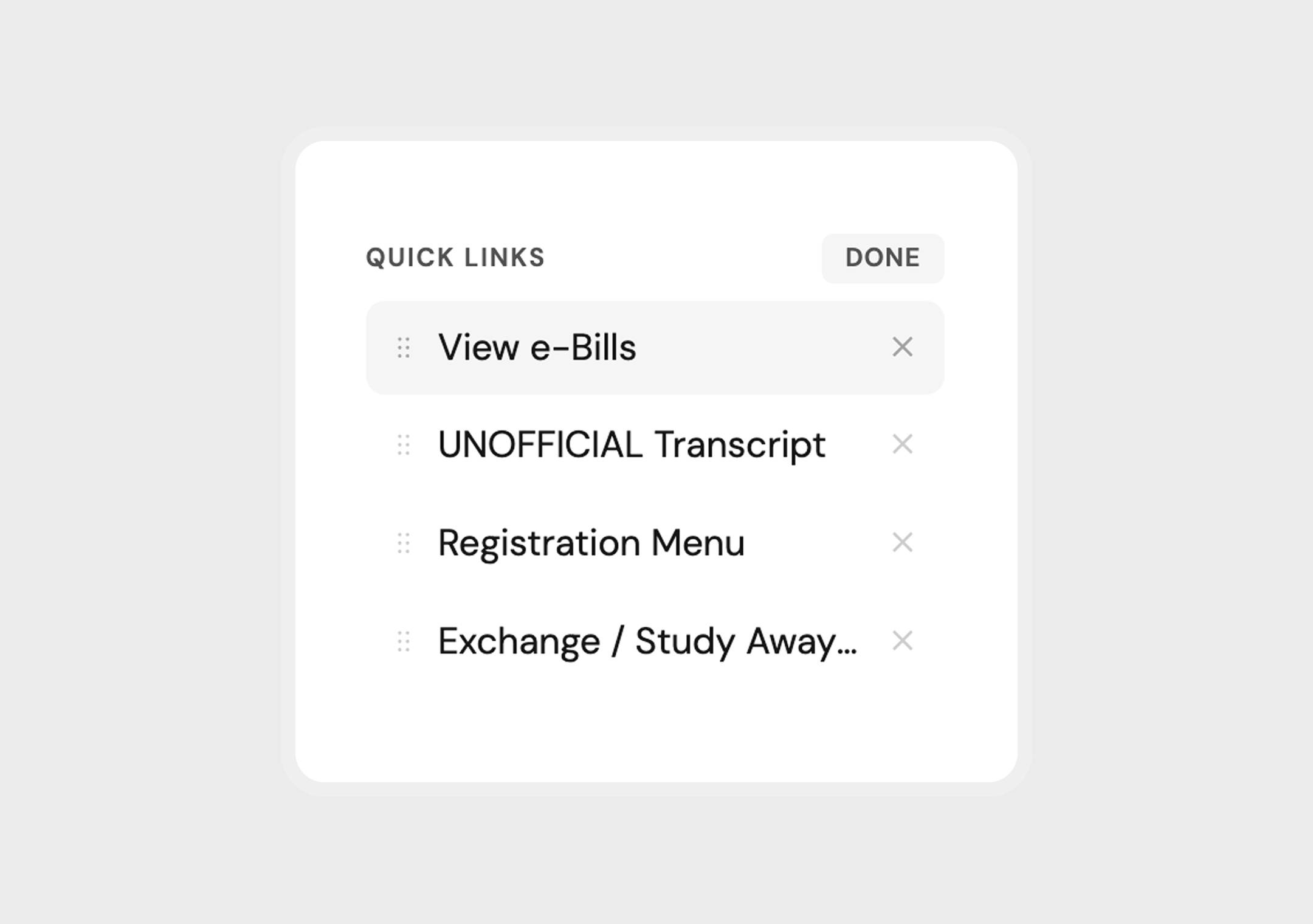
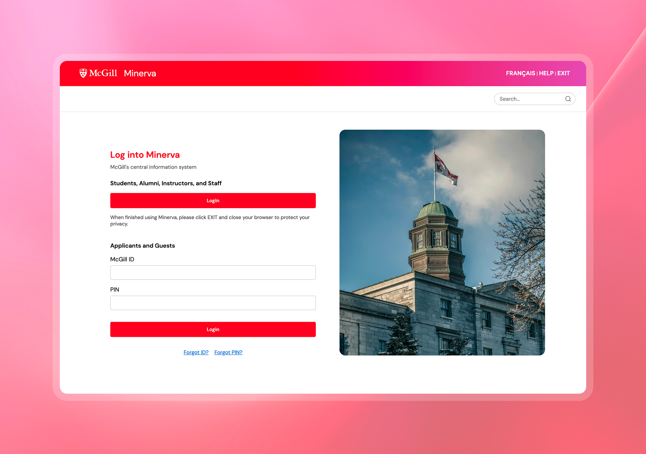
Minerva is McGill University’s central information system, known for its outdated interface. To fix this, I redesigned the UI in Figma and turned the concept into a JavaScript browser extension that applies custom styling to the live site. What started as a Reddit post now lives on the Chrome Web Store with over 200 active users.


Prettify Minerva

The Problem
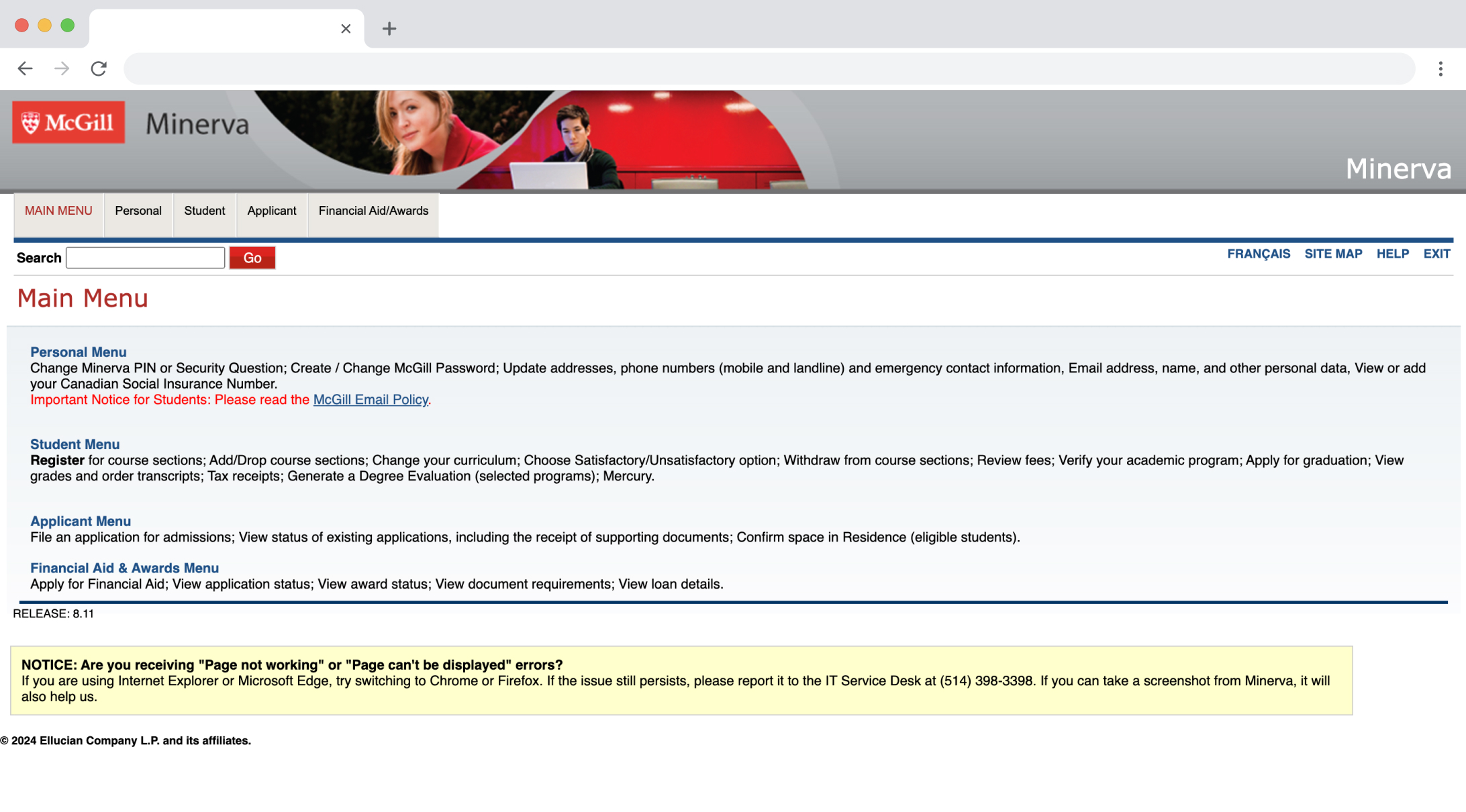
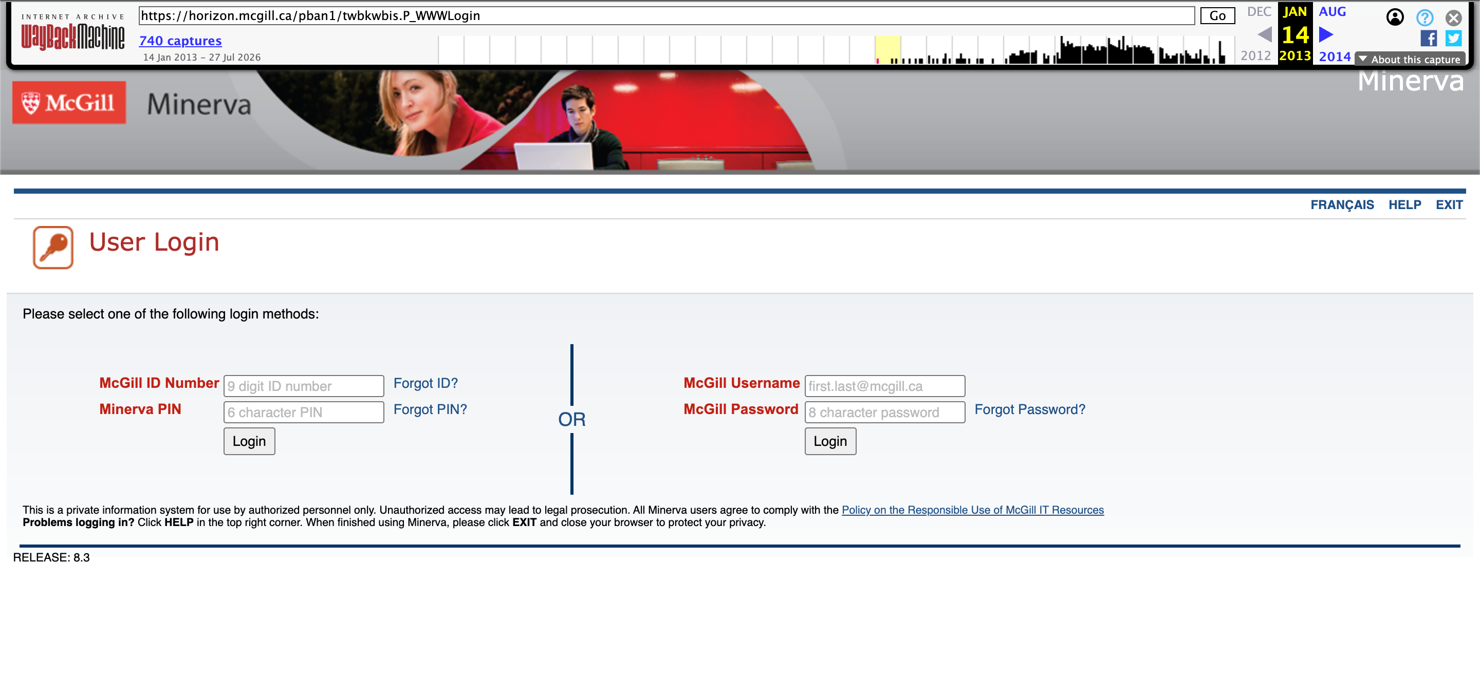
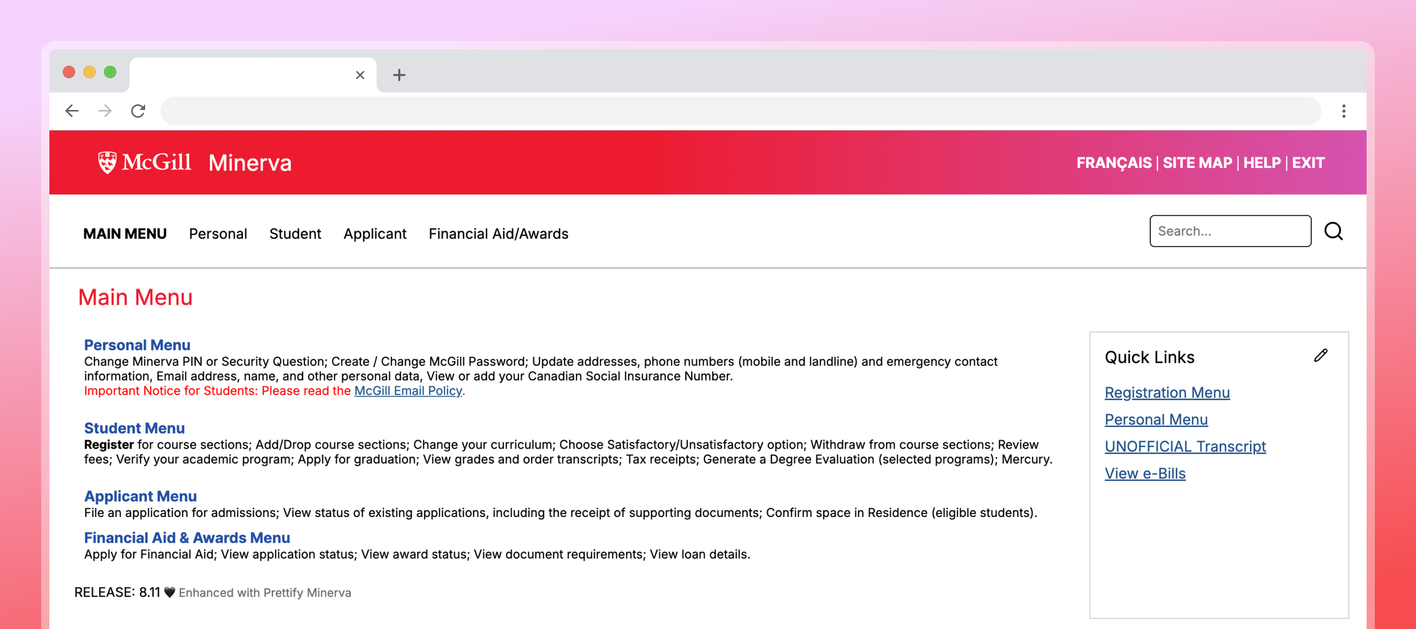
According to the Wayback Machine, Minerva has remained largely unchanged since the 2010s. Through my own experience using the platform and conversations with classmates, I saw an opportunity to reimagine Minerva. The goal was to redesign Minerva to enhance its clarity, usability, and visual appeal. The original interface displays dense information with limited spacing, small typography, and a cluttered layout, creating cognitive overload and hindering navigation, particularly for new users.

Community Response
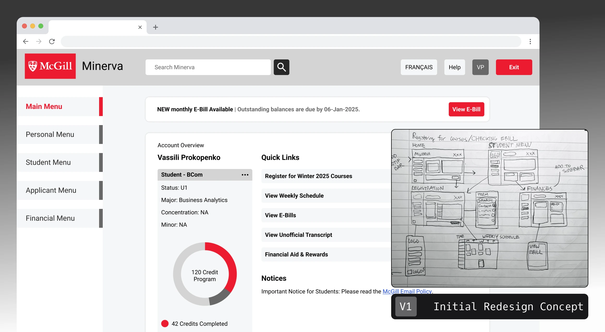
I shared this concept of Minerva on the McGill subreddit which garnered over 70k impressions with positive engagement. This dashboard style design was inspired from other McGill sites like MyCourses, McGill’s learning management system.
“Could this be developed into a Chrome extension? This is a million times better than the current interface.”

Browser Extension Solution
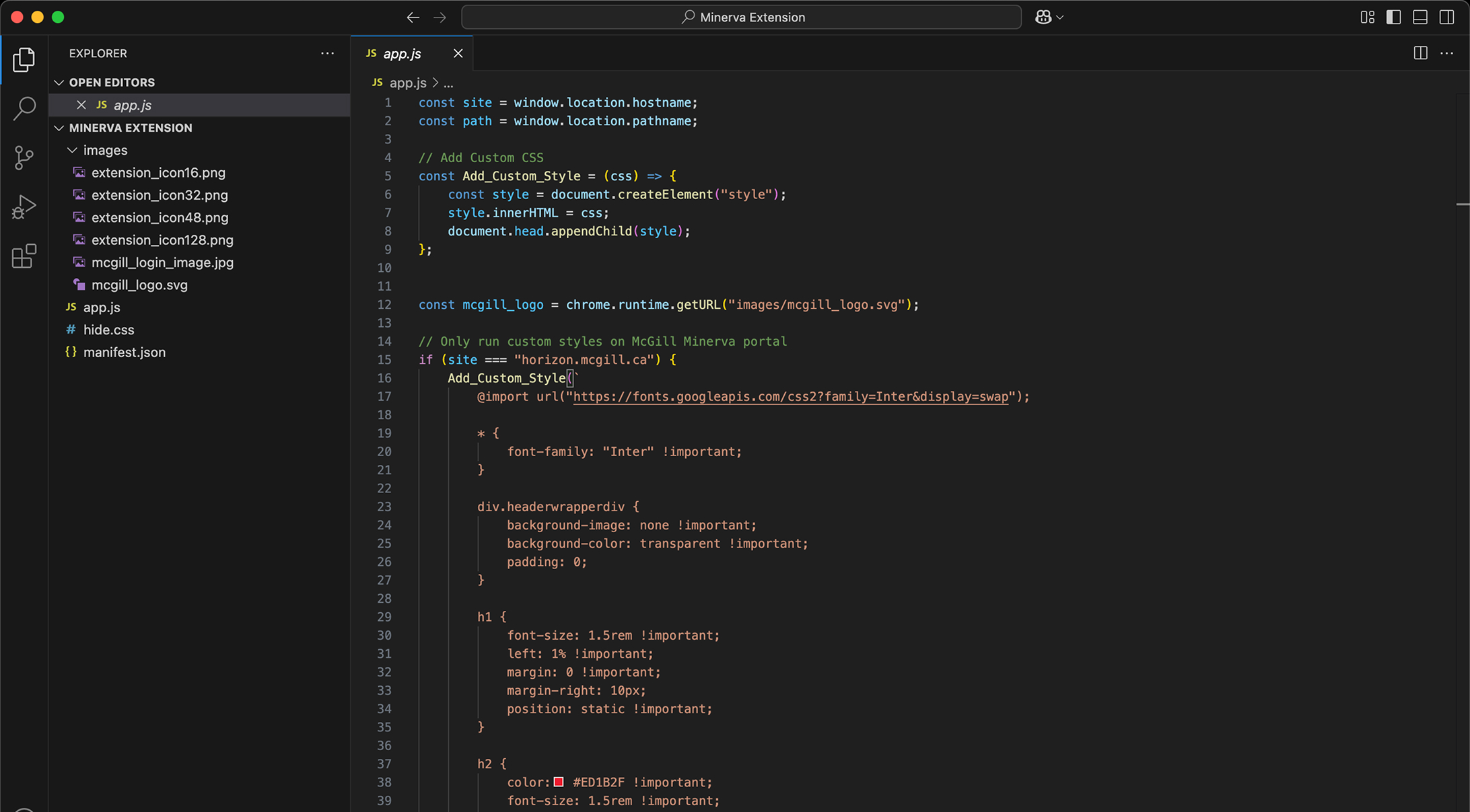
I used JavaScript to directly manipulate page content and HTML structure of the Minerva site. I also injected custom CSS to restyle Minerva’s interface, making the site cleaner and more visually appealing.


Results
After facing a range of challenges like DOM quirks to styling messy table elements, I published the extension on the chrome web store. The extension has gotten over 650+ installs and 200+ active users. It was incredibly rewarding to take an idea from an initial design through development and ultimately launch a real, usable product. Along the way, I deepened my understanding of front-end development using JavaScript, HTML, and CSS.